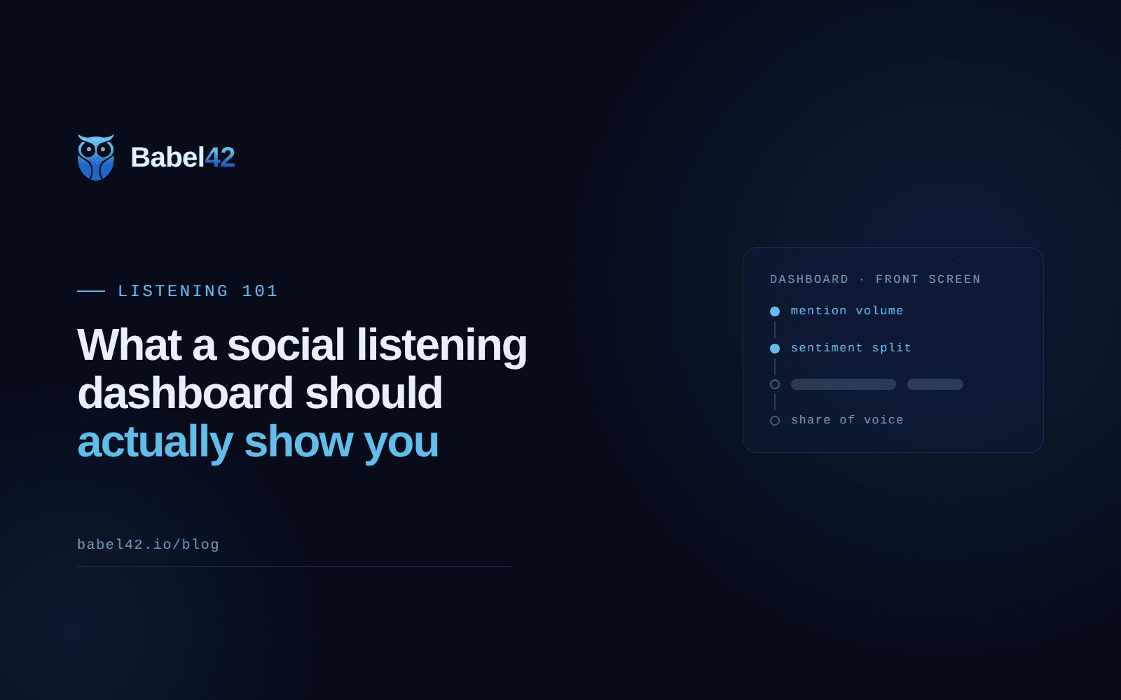
You turn on a social listening dashboard for the first time and it hands you a dozen widgets at once: a line chart, a donut, a leaderboard, a heatmap you didn't ask for. None of it is wrong, exactly. It's just not ordered by what you'd actually check first. A good social listening dashboard has a small front screen and a much bigger set of views behind it, and knowing which numbers belong on which side is most of what separates a dashboard you check daily from one you open once and never again.
This is a guide to that ordering: the handful of numbers that belong on the front screen, why each one is close to useless read alone, and what to tag and compare before the rest of the dashboard earns its keep. Every screenshot below is Babel42's own dashboard. We tracked mentions on a demo project to produce the numbers in it, so they're real to look at, not a live customer's account.
A social listening dashboard has one job
Its job is to tell you what changed since you last looked, not to display everything it's capable of measuring. Every chart on the front screen should answer "is this normal for us, or not," and nothing that doesn't answer that question belongs above the fold. A dashboard that opens with your all-time mention count, with no comparison to anything, is decoration. A dashboard that opens with the same number next to "+18% vs the prior 30 days" is a working tool.
What should a social listening dashboard show first?
The front screen should show four numbers, each against its own prior period: total mentions, unique authors, total reach, and total engagement. Together they answer whether more people are talking, whether it's the same voices repeating or new ones joining, and whether anyone beyond the people talking is actually seeing it.
| Metric | This period | vs prior period |
|---|---|---|
| Total mentions | 12,480 | +18% |
| Unique authors | 6,210 | +11% |
| Total reach | 38.6M | +24% |
| Engagement | 214K | +9% |
That table is a real Babel42 dashboard screen, from a demo project, not a live customer account. Reach climbing faster than mentions (+24% against +18%) is worth a second look on its own: it usually means one post travelled further than the rest, which the volume-by-platform view a click away can confirm.
Volume on its own tells you almost nothing
A mention count needs two things before it means anything: a comparison to the period before it, and a breakdown of where it came from. Ten thousand mentions spread evenly across your usual channels is a normal week. Ten thousand mentions with eight thousand of them on one platform is a single event, and the dashboard should make that obvious without you having to dig.
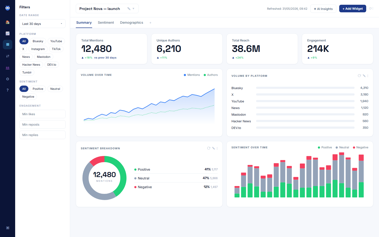
In the screenshot above, that same 12,480-mention month breaks down as 4,310 on Bluesky, 3,180 on X, 1,940 on YouTube, 1,120 on News, 820 on Mastodon, 560 on Hacker News and 350 on DEV.to. No single platform is carrying the whole number, which is what a healthy, broad-based mention count looks like next to a chart rather than as a single figure.
Read sentiment as a line, not a score
A single sentiment percentage is a snapshot; a sentiment trend is a signal. The distinction matters because automated sentiment scoring is an estimate, not a fact: in Van Hee et al., "SemEval-2018 Task 3: Irony Detection in English Tweets", the best of dozens of competing research systems reached an F1 of 0.71 on the narrow question of whether a tweet was ironic. "Great, another outage" reads positive to anything scoring individual words. That's exactly why one post's score isn't worth acting on, and a week's worth of scores moving together is.
The screenshot above also shows the sentiment split for that same period: 41% positive, 47% neutral, 12% negative, plus a day-by-day bar chart of how that mix has shifted. Read the bars, not just the donut. A steady 12% negative slice is background noise in most categories; a negative slice that's been widening for two weeks running is the pattern worth opening a mention thread to check.
Share of voice puts a single number in context
A sentiment score or a mention count in isolation is hard to judge, because you have nothing to measure it against. Share of voice fixes that by putting your brand and a set of named competitors on the same chart, so a dip reads as either "something happening to us" or "something happening to everyone in the category this week."
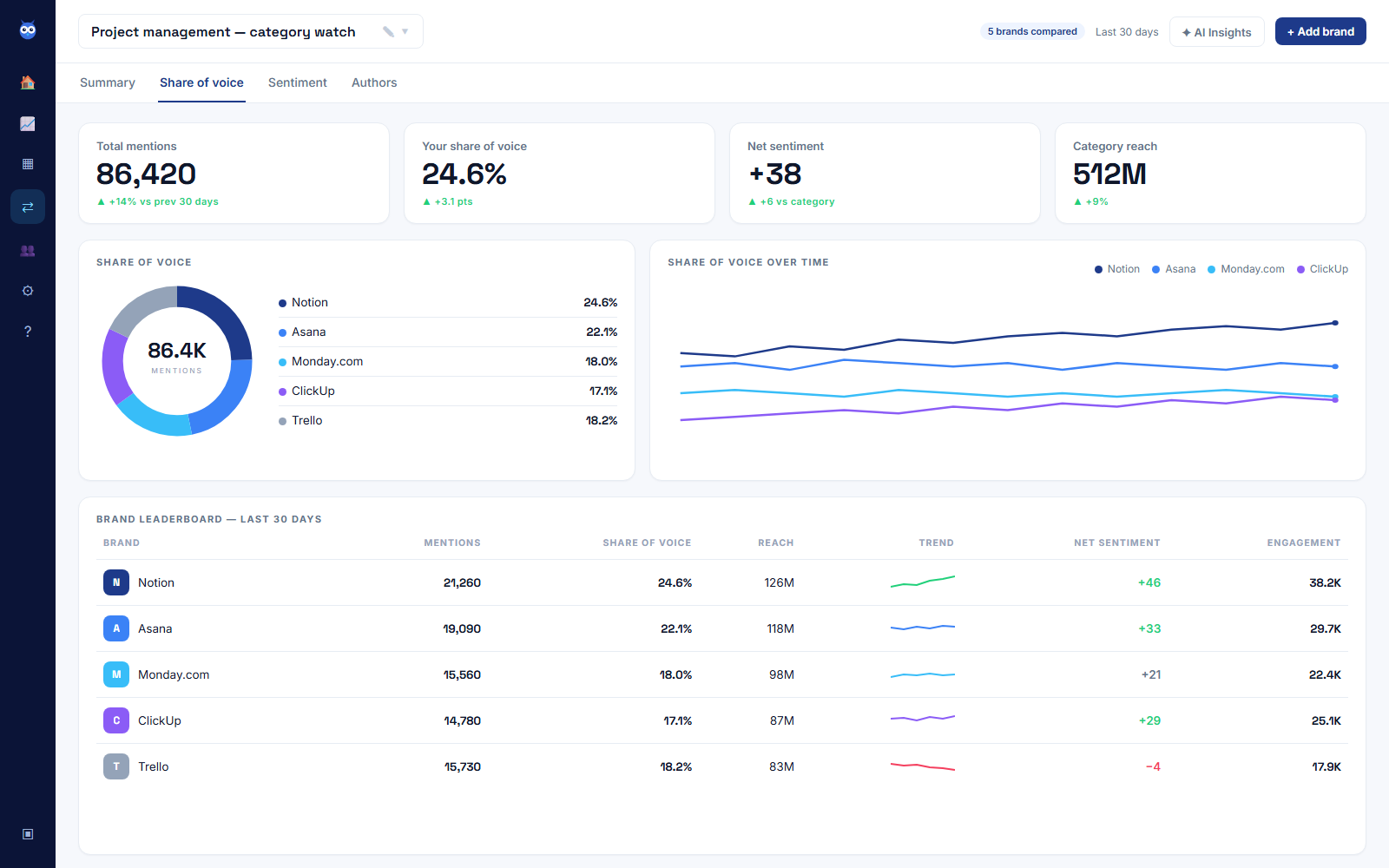
This is a demo project management category watch, not a live customer account, and it's worth reading as a shape rather than a set of brand names: the tracked brand holds 24.6% of 86,420 category mentions, ahead of the next competitor at 22.1%, with net sentiment of +38 sitting well above a rival trending the other way on the line chart beside it. That's a faster read of relative standing than opening each brand's numbers one at a time, and it's the reason a share-of-voice view earns a permanent place on the dashboard rather than a one-off report.
Who's driving the conversation matters as much as how much
Ten thousand mentions from ordinary accounts and a thousand mentions led by one large one look identical on a volume chart and mean completely different things. Public conversation is lopsided by default: Pew Research Center's "Contending with the 80/20 rule when studying online behavior" found that the most active 10% of Twitter users produce 80% of all tweets from US adults. An author ranking by reach and engagement, sitting next to the volume chart rather than buried in its own tab, is what tells you whether this week's spike is a real shift in how people feel or one well-followed account having an opinion.
Group the noise before you chart it
A dashboard that lumps every mention of your brand into one line hides more than it shows once you're tracking more than a name. Keyword lists group individual queries, product names, named competitors, campaign hashtags, feature requests, so each group gets its own line rather than disappearing into the total.
| Keyword list | Share of mentions |
|---|---|
| Products | 40% |
| Competitors | 29% |
| Campaigns | 16% |
| Feature requests | 15% |
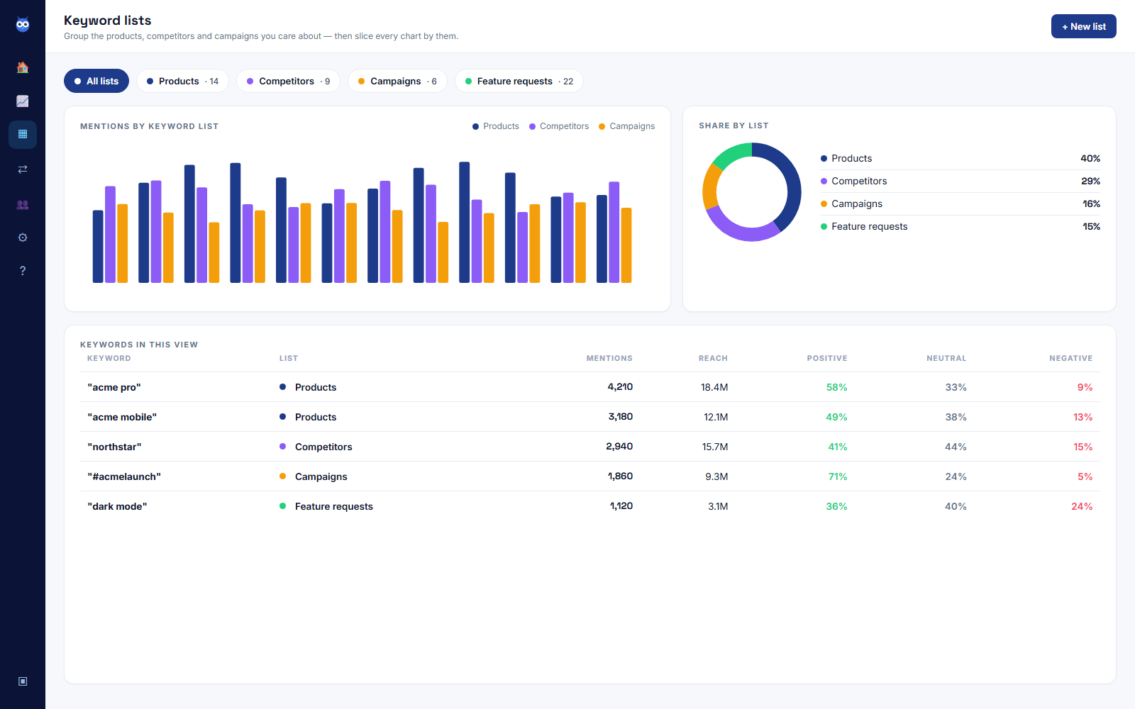
Splitting the total this way turns "mentions are up" into something you can act on: a jump inside "Products" means people are talking about what you sell, a jump inside "Competitors" means the category is having a moment that isn't about you specifically, and either one tells you something a single combined line never could.
What to leave off the front screen
Every extra widget on the front screen is something to glance past before you get to the four numbers that matter, so the discipline is to keep the daily view small and put everything else one click away. Demographics, keyword-list breakdowns, individual author profiles and platform-specific detail are all genuinely useful, and all belong on a second screen you open when the front screen tells you something's worth digging into, not on the screen you check every morning. A dashboard earns daily use by being fast to read, not by fitting in everything it can measure.
Building your first dashboard
Start with one monitor for your brand name and its obvious variations, refined with AND, OR and NOT so a mention of "the app" from an unrelated product doesn't slip through. Add a second monitor for two or three named competitors as soon as you want the share-of-voice view above to mean anything, since it needs something to compare you against. As mentions grow past a name or two, split them into keyword lists for products, competitors and campaigns so the volume chart stays readable. Then set alerts for a volume spike, a sentiment dip or a mention from a high-reach account, so the dashboard tells you when something changed instead of you having to remember to check.
Babel42's free plan gives you 500 mentions a month, two monitors and one channel across five networks (Bluesky, YouTube, News, Hacker News and DEV.to), with AI sentiment analysis and 90 days of history, no card required, enough to build the brand-and-competitor pair above and see whether the front screen changes how quickly you catch what matters. If you haven't set anything up yet, how to do social listening for free walks through that first monitor. For the mechanics behind everything on this dashboard, how do social listening tools work covers the collection, cleaning and scoring pipeline that produces these numbers in the first place, and for the reputation side of the same screen, how to set up brand reputation monitoring covers the weekly routine for reading it. If it's a specific rival you're watching rather than the category as a whole, how to monitor competitor activity goes deeper on that side of the same setup.